-
The Studio Bay project.
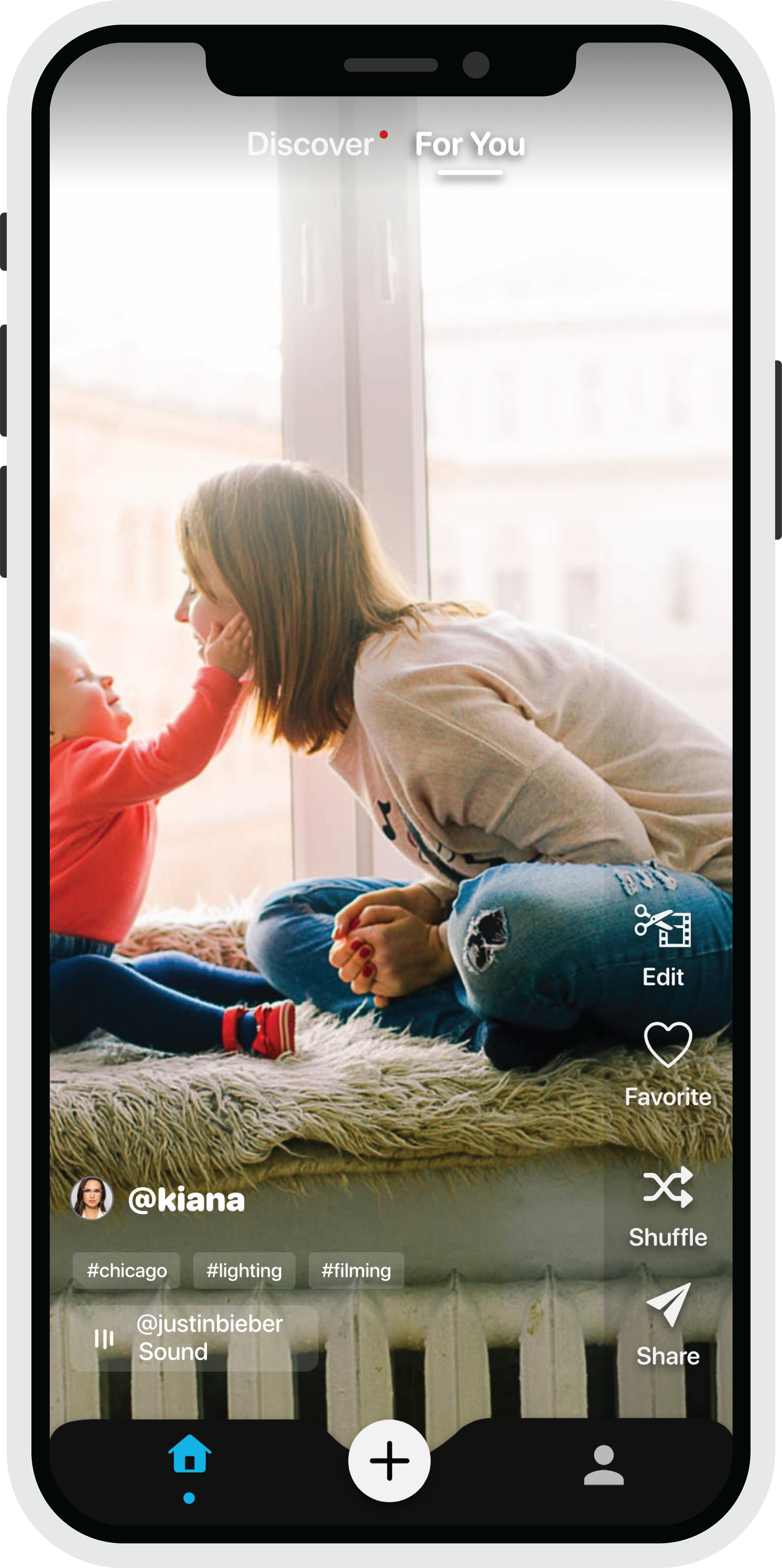
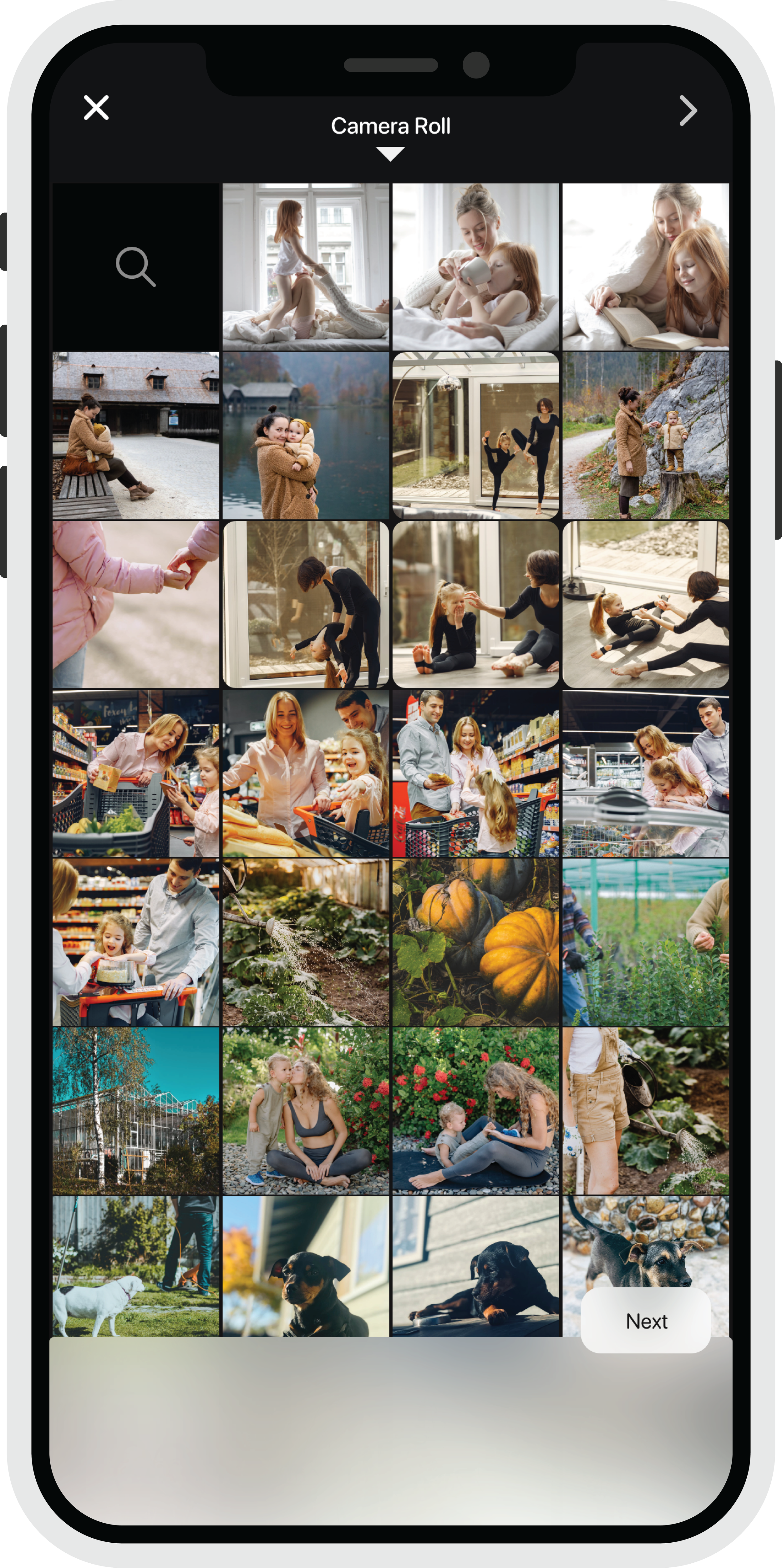
The challenge: How do we help millions of people cut through the clutter of their camera roll to make movie content in seconds and make it accessible at their fingertips?
This pre-existing product I was presented with is a video editing app with many incredible, complex functions.
The company wants to target the millions of individuals who don't know how to edit all the clutter of their camera roll—solving this by giving them auto-generated movies of their own content.
As the team’s designer, it has been a pleasure to be working with the inventor of the IP Michael Zaletel, the producer, Jonas Lowrance, and the renowned Director, Michael Bay, and his whole team of video editors, including the design company called Antenna. Also, I had the pleasure of collaborating with Apple's design team.
UX Strategy & UI Designer
My role in the project was to participate in all activities, end-to-end, from immersion to delivery, focusing on interactive design and facilitating design research. I was involved with the following responsibilities over the course of this project:
Immersion
Stakeholder interviews
Interaction scan
Investor Meetings
Define & Ideate
Current state journey map
Archetypes & Ecosystem sketch
Workshop design & facilitation
Delivery
Concept Visualizations
Future state journey map
Strategy Deck
-
Sketches
Design Process
I usually start the design process with low-fidelity wireframes. This is the way I iterate through many design options quickly. By drawing it out on paper, I can feel the way the UX will begin to feel.
Details:
Sketches give the base of the flow and build out. I am able to visualize the bones of the project. It's important for me to have a labeled and detailed sketch before I begin the design process. It helps with brainstorming and presenting the idea to the team.
Understanding the targeted demographic, it made it more simple to stylize buttons, colors and the appropriate amount of screens.
It's never one version of sketching to ensure I have a good foundation before I begin designing in XD. I am always open-minded to the teams’ advice and added vision.
Each sketch version is usually an option of different flows to make the product as simple as possible - focusing on the amount of taps a user may have to take.
It is so important that the arrangement of visual elements is balanced.
These sketches helped me move forward by ensuring that the compani’s vision was met to the best of my ability before embarking on the digital version.
Wireframes
At the beginning of my design process, I created wireframes for testing purposes.
Useful: To see the sketches become more alive and presented much more detailed decisions
I wanted to make sure the wireframe was simple
Low fidelity prototype was necessary, eventually, over time I developed a high-fidelity prototype
Using the Adobe Suite such as XD, I was able to get the proper user feedback based on the feel of the flow
Research, Research, Research
I can't emphasize this enough, doing your own clinical research on other apps and websites will always keep you up to date with every trend. Also, trust your instincts. Being a creator of an app feels like I'm designing a digital brain.
UI Design
Once I tested out all usability mistakes, I started designing the final screens in Adobe XD.
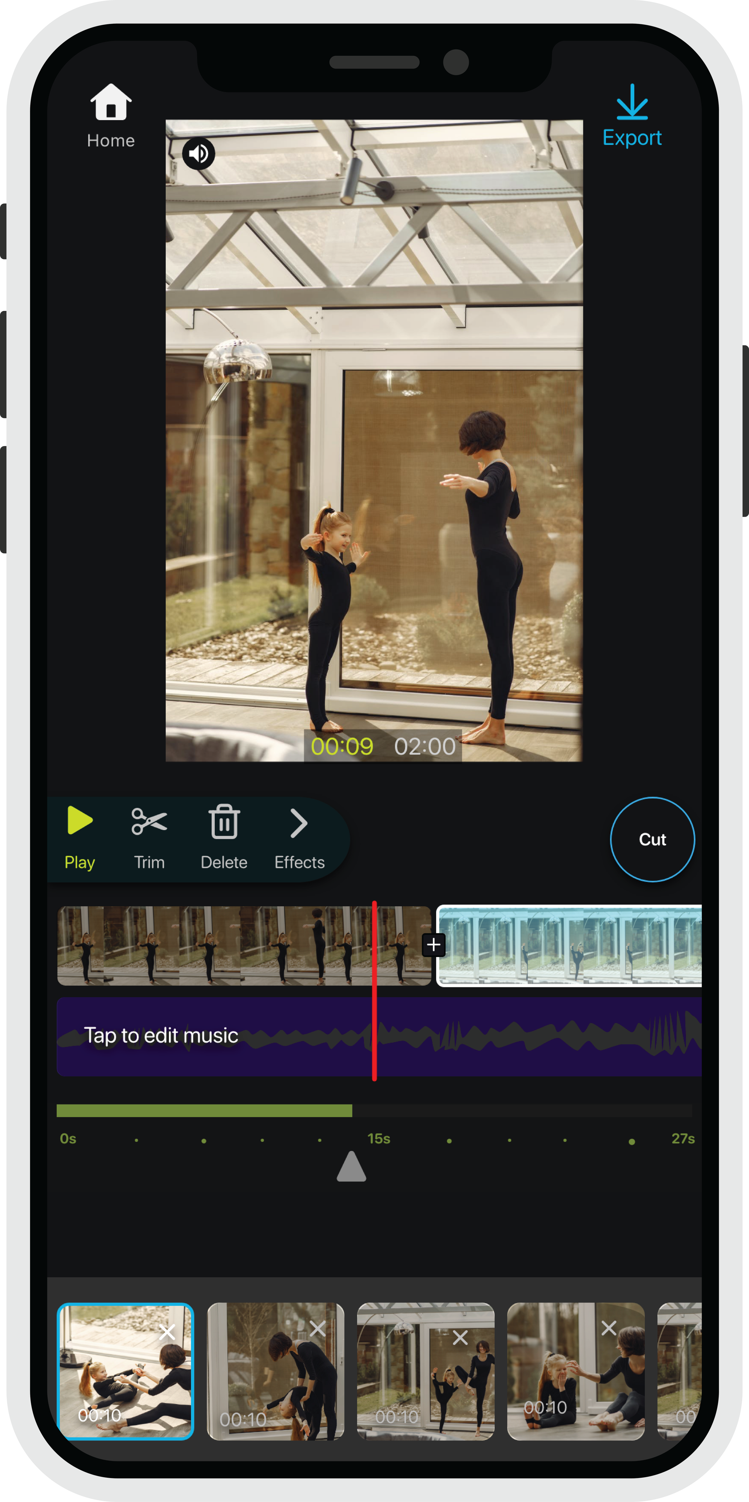
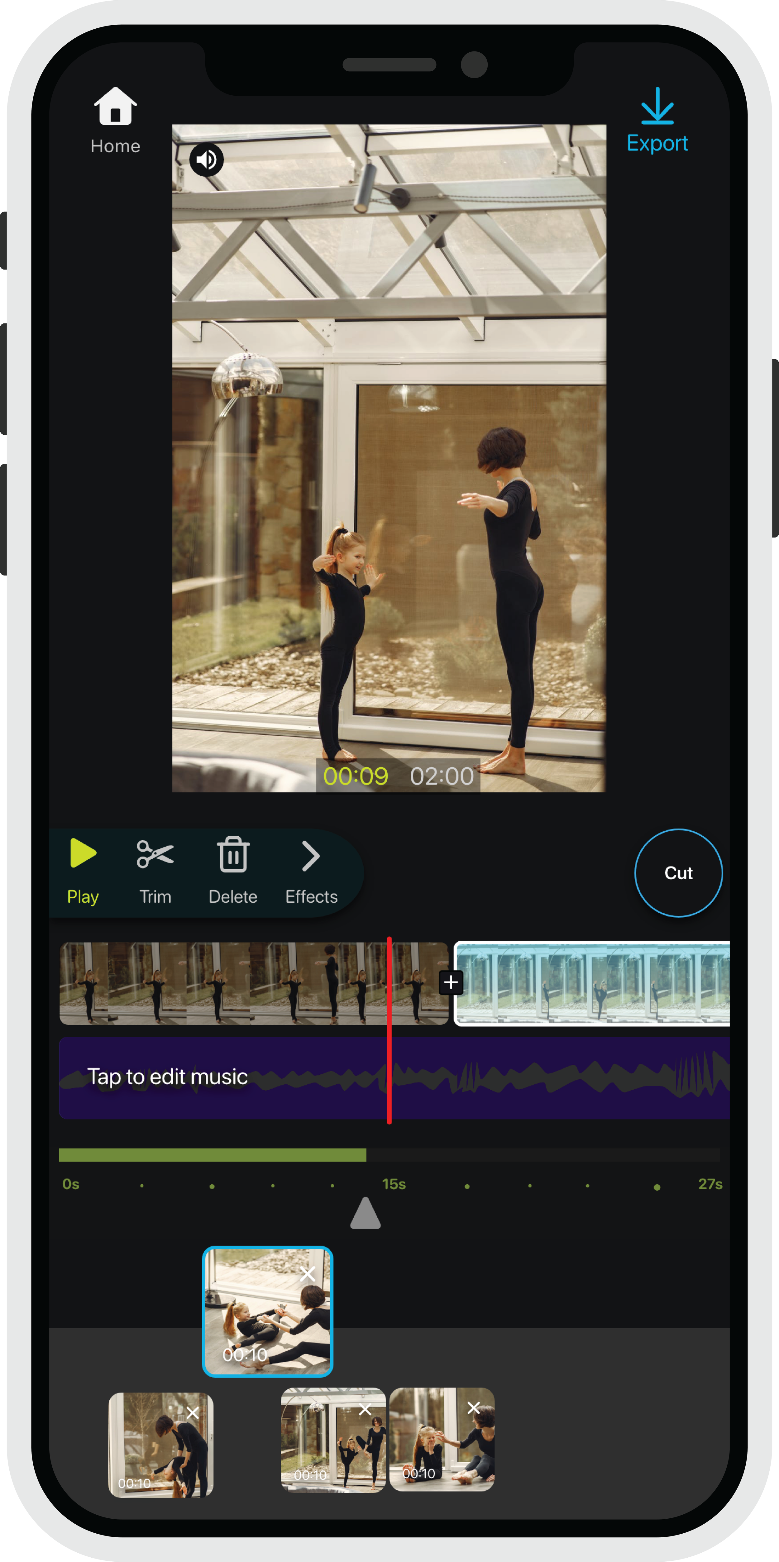
I trusted my instincts on the visual style. Since it is an editing room my first inclination was it needs to have a sleek dark feel.
I was inspired by the history of people editing movies in a dark room, so I wanted to replicate this feel in design.
I followed Apple iOS guidelines. I also paid close attention to the typography and iconography formats, making sure everything matched.
So much of this app fills me with pride, the haptics the free-flowing interactive movement of being able to use touch as actions rather than creating a button for every action. The clean and organized style is pleasing to the eye of users.
My final design is never final. The world is always evolving, and I enjoy watching the growth of an app continue to expand because of consistent research and change.
The design has helped achieve many business goals, accumulating funding for more user testing and satisfaction.
-
My Experience
I learned a great number of things, as I do with any project I am dedicated to. The first thing I learned about was matching typography with iconography. It is a must, to make the appearance look like it all flows. I used AI to customize my own icons/symbols throughout the app and using the guidelines of SF Symbols. I also did this with the typography used throughout the app. Less is more; I really enjoy being able to give a simplistic feel and a comfortable, consistent design way across all scales. Using simple color changes and haptics throughout the app really enhanced the navigation. Also, creating those very subtle animations to certain icons or movement for the user to feel like they have control over what they're doing in the app.
My biggest struggle was explaining to the developers what I wanted sometimes, Conveying that to make sure everything was clear. I was also told certain things I wanted couldn't be done regarding certain movements and concepts for the app to function.
I overcame this by setting up 2 sets of sprints for everyday tasks the developers needed to complete including bug fixes and design updates. When something was said it couldn't be done, I would conduct my own research for any open code that could either be the starting point I was looking for or find the solution.
Being honest is a good thing.
studio bay
apple
“The layout and wiring are superb.”
michael bay


